How to Use Ri-BIT Dashboards (ALL Suppliers)
Overview
A Dashboard has 3 sections or panes. The dashboards list and the filters panes can both be closed to give you a larger view of the dashboard.
- Dashboards List – this is on the left and will list the dashboards available to you
- Dashboard – this is in the center and is your working dashboard
- Filters – this is on the right and shows what filters you have applied to your dashboard
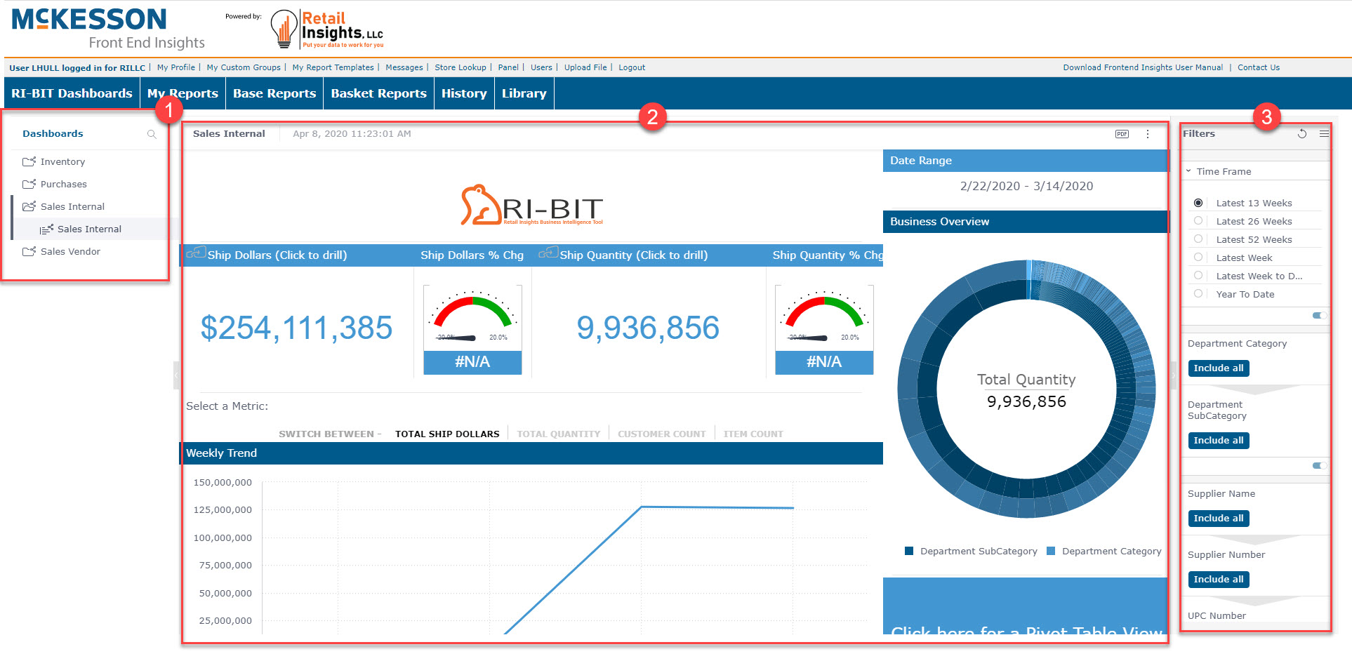
These outside panes, Dashboards List and Filters, can be closed or opened by clicking on the  or
or  about halfway down the edge of each panel separating it from the dashboard in the center.
In addition to having lots of widgets, you have the ability to change dashboard filters, drill into dashboards, receive email reports, create and manage folders, export a dashboard to PDF or as an image.
Viewing Dashboards
You can view dashboards that have been shared with you. A dashboard that was shared with you appears with this  icon in the Dashboards list.
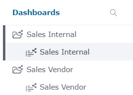
To view a dashboard:
- Click the name of the dashboard in the Dashboards list on the HOME page.
- You will see the status of your dashboard loading. Please be patient while the dashboard loads
Downloading a Dashboard as a PDF
You can export dashboards to PDF, as follows:
- Click the PDF button at the top right of the screen, OR
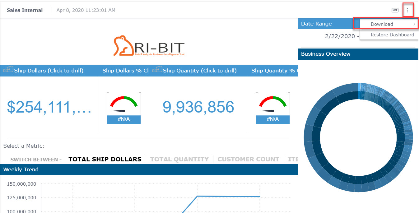
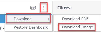
- Click the Options button at the top right of the screen, click Download, and click Download PDF.
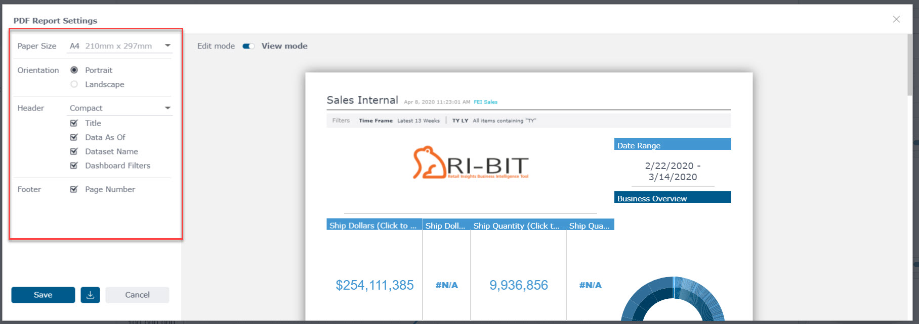
You can select the paper size and orientation (Portrait/Landscape), as well as the following configuration options:
- Paper Size
- Orientation
- Header
- Title
- Data As Of
- Dataset Name
- Dashboard Filters
- Footer
- Page Number
Downloading a Dashboard as an Image
You can download the dashboard as an image. This can be useful for including the dashboard in a presentation, website, etc.
To download the image:
- Click the Options button at the top right of the screen, and click Download Image.
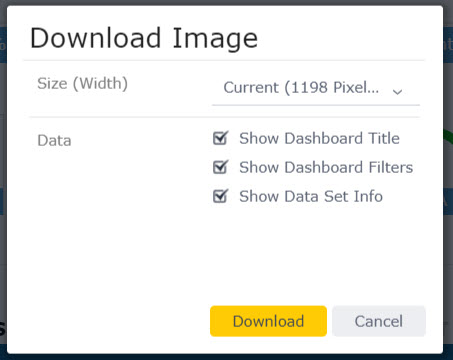
- You can also define the following additional settings:
- Show Dashboard Title: Turning this on will display the dashboard name at the top of the PDF.
- Show Dashboard Filters: Turning this on will display a summary of the dashboard filter selections at the top of the PDF.
- Show ElastiCube Info: Turning this on will display the ElastiCube name and last build time at the top of the PDF.
Interacting with Filters
Viewers can interact with filters for analyzing data. Through the Filters pane, you can modify filters in a dashboard and change the way values are sorted in a visualization. This is useful for focusing on data displayed in dashboards that have been shared by the dashboard’s owner.
As a Viewer, you can select and deselect filter visuals on a dashboard. Each time you interact with a filter, for example by selecting or entering a value, the filter is immediately applied to your dashboard.
Anytime you change a filter, you may see a loading page. Please be patient as your dashboard loads with your updated filter selections.
After you have configured the relevant filters, you can save it as your default filters view:
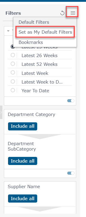
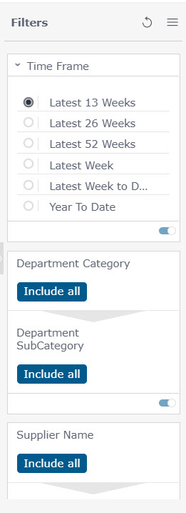
The filter panel shows Category with all options included, but the Time Frame filter is just filtered on Latest 13 Weeks.
Viewers can interact with filters in a number of ways:
Filter Panel
- Make a different selection in the filter controls displayed in the FILTER panel on the right side of the dashboard, as shown in the image above:
OR
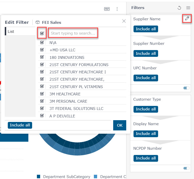
- Click on the pencil icon next to the filter name in the dashboard. Search within any filter from the Filter panel by clicking the first row and begin entering a search word. Click the top check box to include all options within a search, or only check certain options.
Interactive Widget
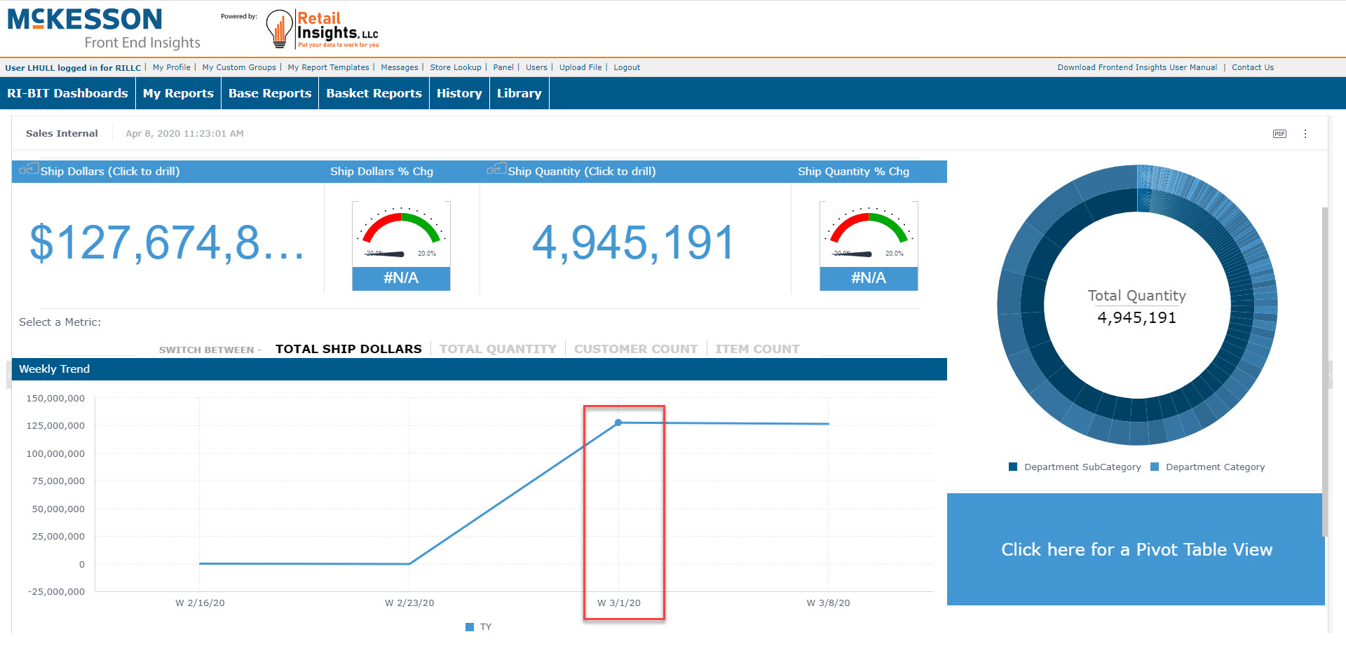
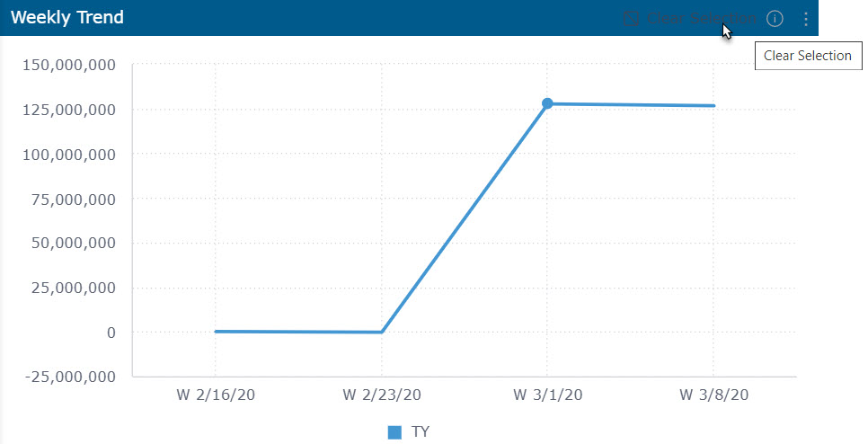
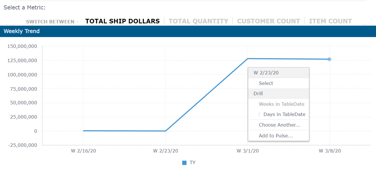
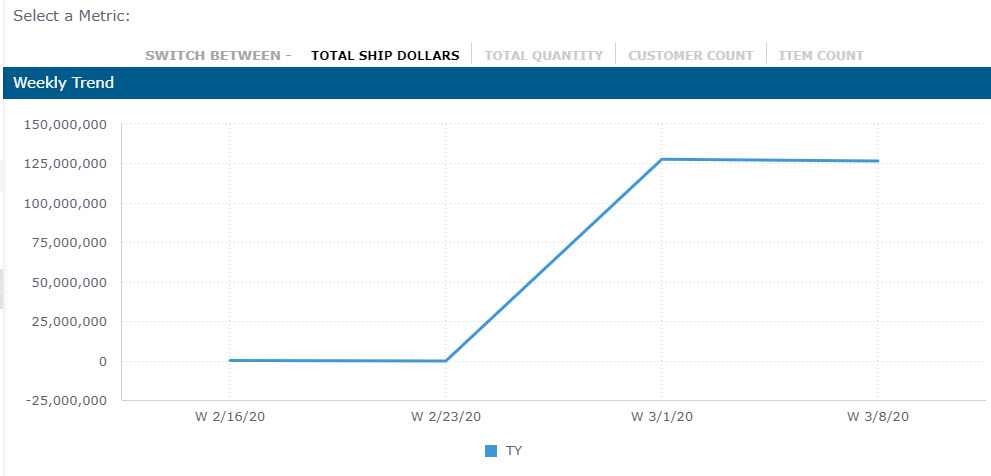
The widgets within the dashboards are interactive. You can left-click on any widget and filter the entire dashboard by that selection. You can see in the screenshot below, the data is filtered on Total Ship Dollars for the week of 3/1/2020. All data above and to the right of the Weekly Trend line graph reflect data based on the week of 3/1/2020.
Remove Filters
Filters can be removed by using the pencil to open the filter selection and checking the top most box to Include All. You can also use the Options button at the top of the Filters panel and click on Default filters.
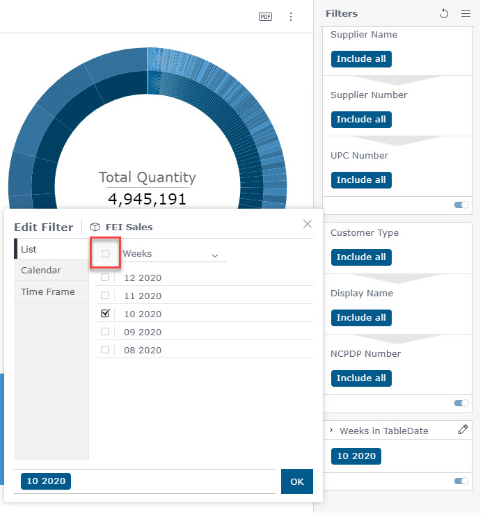
You can also hover over the widget containing the filter and click 'Clear Selection' to restore with widget back to its original state:
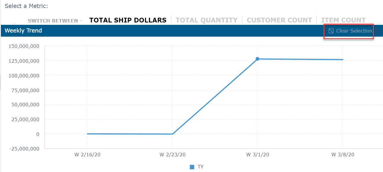
Breadcrumb trails will need to be removed from each widget they were applied to unless you are restoring the dashboard to the original shared version.
Reset Dashboard
You can reset your Dashboard to the originally published version by clicking on the Options button at the top of the dashboard and selecting Restore Dashboard.
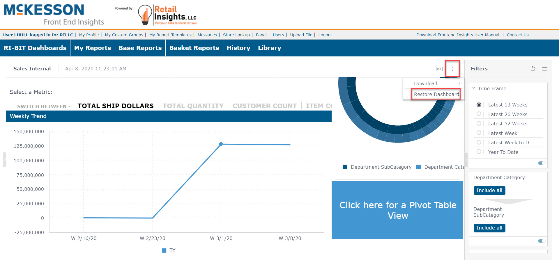
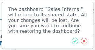
You will see a warning asking for confirmation to reset the dashboard to the original shared state. Click the green check to restore the dashboard, or click the 'x' to cancel.
In addition, Viewers can perform the following procedures:
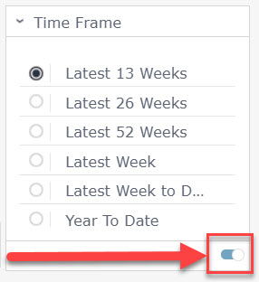
Switch Filters On and Off
Filters can be switched on and off via the toggle at the lower right of the filter segment.
Saving your Default Filters View
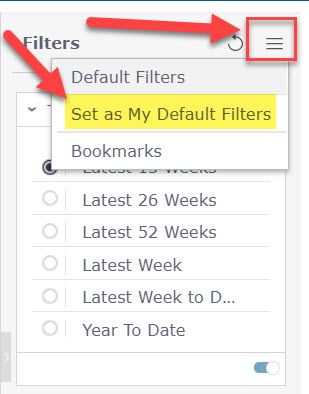
Once you have your filters set for your dashboard, you can save them as your default filters by clicking the options button at the top of the Filters pane and selecting Set as My Default Filter. This means that each time you open this specific dashboard; it will be filtered the way you want to see it.
Widgets
Widgets are objects such as charts and graphs. Options for downloading the widget are available by clicking on the  in the upper right corner of the widget. Download options are as an image or as a CSV file. If the widget is a table, you can also download as an Excel file.
Clicking on a specific portion of a widget, for instance a specific bar in a bar chart, will filter all widgets on the dashboard. To reset the widget, click on the Clear Selection button in the upper right corner of the widget.
Clicking on the  at the top of the Filters panel gives you options to set your current selections as default filter or to set a bookmark
Clicking on the  at the top of the Filters panel will allow you to reset to the default filters.
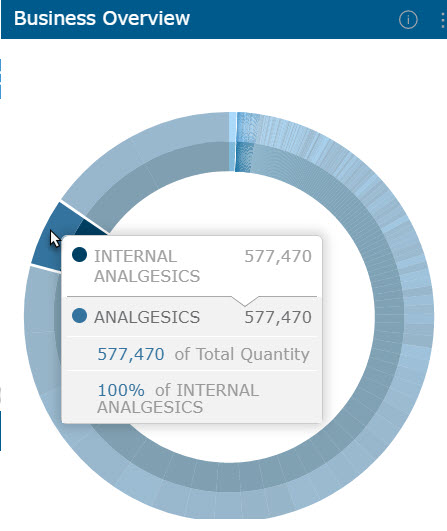
As you hover over the widgets, additional information about that specific piece of information will appear in a pop up window.
Making Selections in a Widget
You can click on a specific portion of a widget to select it. Doing so filters the dashboard according to the selected data by adding a filter to the dashboard’s FILTERS panel.
You can also use the selection to drill down in the widget. To select an item in a widget for filtering:
- Left-click an item in a widget to automatically select it and add a dashboard filter according to the selection.
- For multiple selection, use the Ctrl key. When released, a menu will appear. Click SELECT.
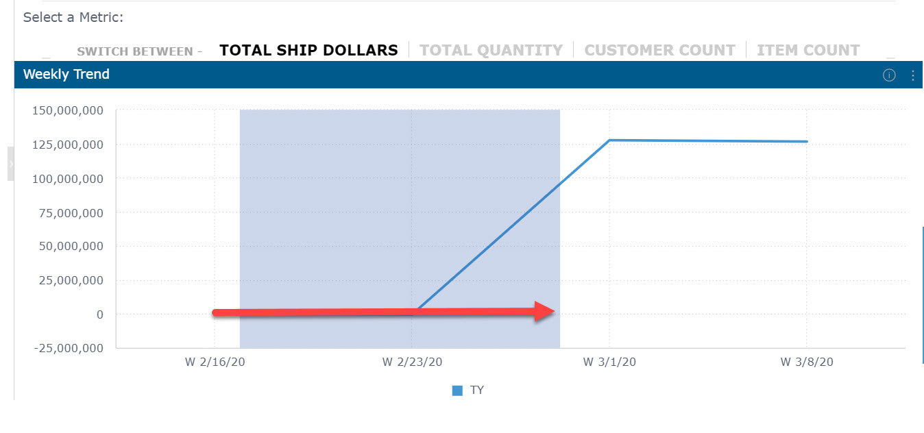
- In chart widgets, you can drag and draw the area to be selected, as shown below:
Zooming In/Out in Charts
When a widget contains more data than can comfortably be displayed in one view, a zoom bar may be displayed under the widget. The zoom bar enables you to scroll right and left and to zoom in/out of different parts of the widget.
The dark gray vertical bars to the left and right of the scroll bar represent what is shown in the widget:
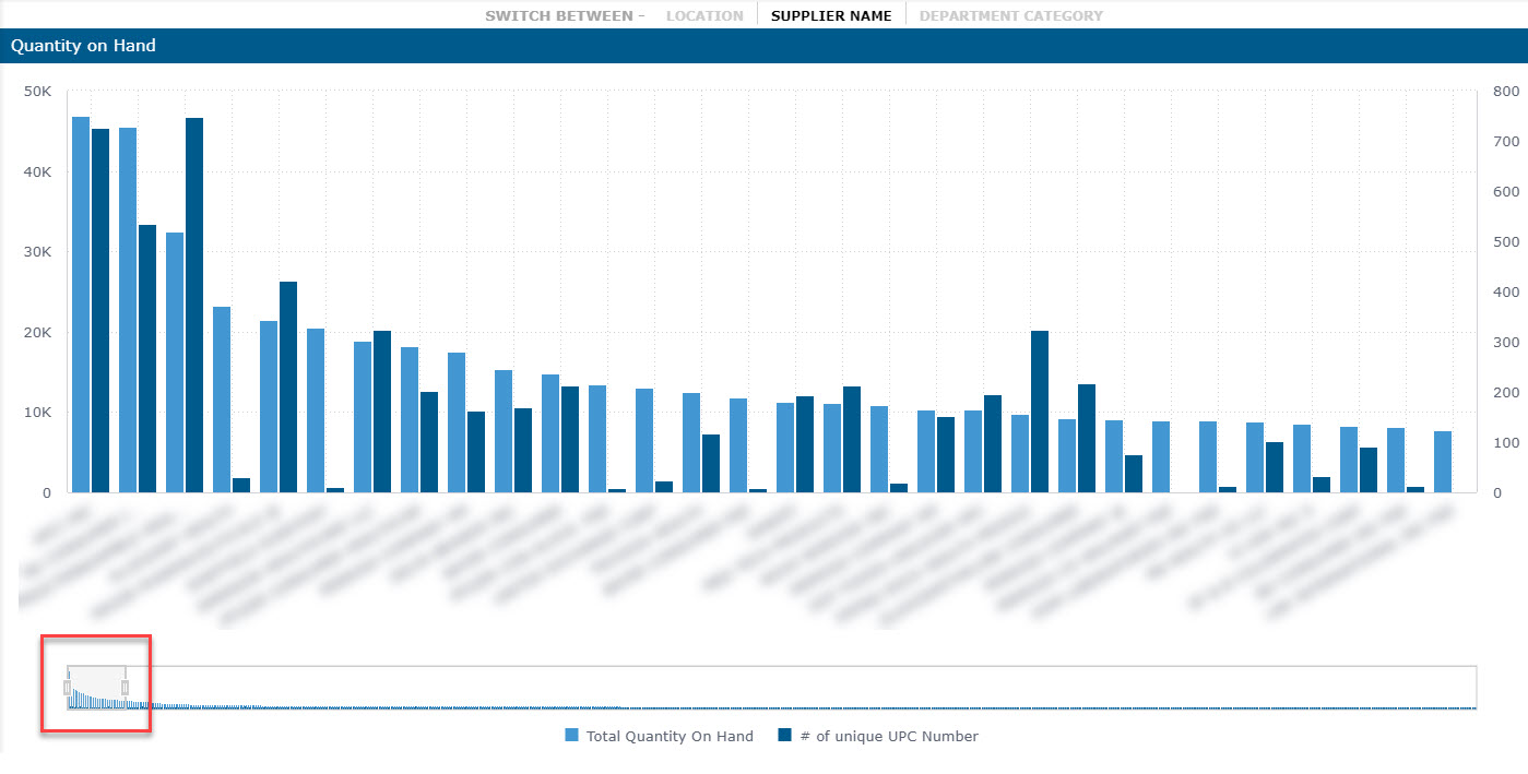
To zoom into an area of the chart, drag the bars closer together and position them immediately to the right and left of the area to be displayed.
To zoom out, drag the bars further apart.

Drilling Down in a Widget
You can drill down in most widgets to get an in-depth view of a selected value.
To drill down into a chart:
- In this widget, right-clicking on Cold & Allergy “pops out” that segment and gives you the Drill menu
- As you click and drill, the breadcrumb trail will display across the top of the widget based upon your selections
- When you want to apply your selections, left-click on that portion of the widget and your filter will be applied to the entire dashboard. You will also see your filter selection in the filter pane.
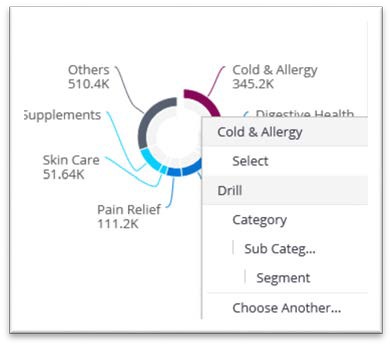
To drill up to a higher level, click on a breadcrumb. To drill all the way up, click on the X icon.

Exporting Widgets to CSV/Excel
You can export widgets in the CSV format. This is also useful for using with Excel. Only the displayed (filtered) data is exported according to the currently selected filters.
- To export a widget to CSV, left-click the download button, then click CSV
- For an image, select image instead
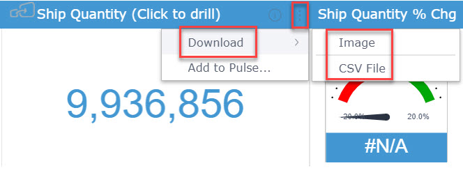
Tip: The image size will reflect the size of the widget on the screen when you download it. To create a larger image, we recommend enlarging your screen.
Widget Types
Indicator
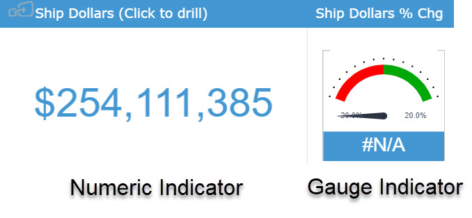
The Indicator widget will display one or two numeric values as a number, gauge or ticker. These can also be color-coded to represent the value, such as a green up arrow or a red down arrow.
Line Chart
The line chart is one of the most commonly used widgets. Line charts are used for various business cases, including:
- Comparing data over time and viewing trends. Example: Analyze sales revenue for the past year.
- Comparing changes over the same period of time for more than one group or category. Example: Analyze expenditures of different business units for the past year.
Column Chart
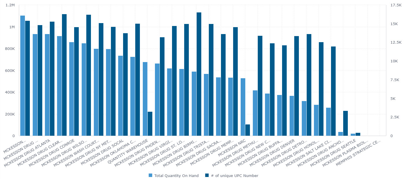
The column chart can be used for comparing items and comparing data over time. The chart can include multiple values on both the X and Y axis, as well as a break down by categories displayed on the Y axis.
You can also combine the column chart with a line chart.
Bar Chart
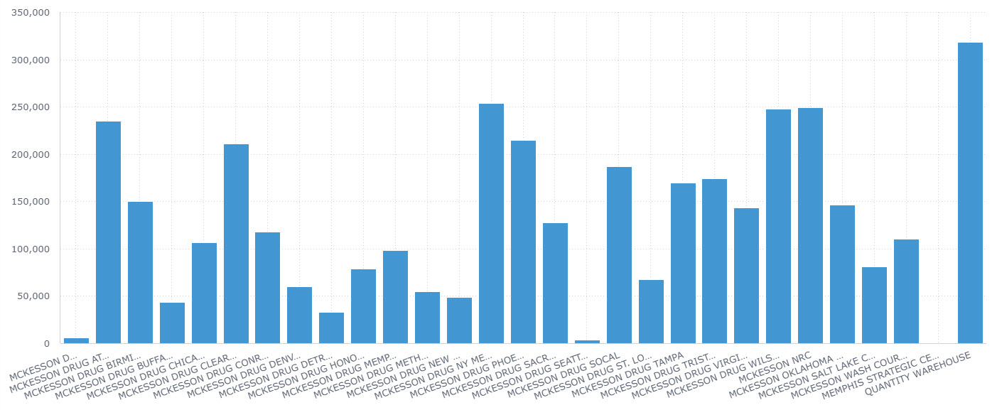
Use the bar chart to compare many items. The bar chart typically presents categories or items (descriptive data) displayed along the Y axis, with their values displayed on the X axis. You can also break up the values by another category or groups.
Pie Chart
Use the Pie chart to display proportional data, and/or percentages.
Area Chart
An Area chart is very similar to a Line chart except that the areas under each line are filled in (colored), and it is possible to display them as stacked. We recommend this chart to display absolute or relative (stacked) values over a time period.
Pivot Table
Pivot tables are one of the most useful widgets for visualizing data. You can quickly summarize and analyze large amounts of data.
Make use of additional features such as color formatting and data bars to enhance the visual aspects.
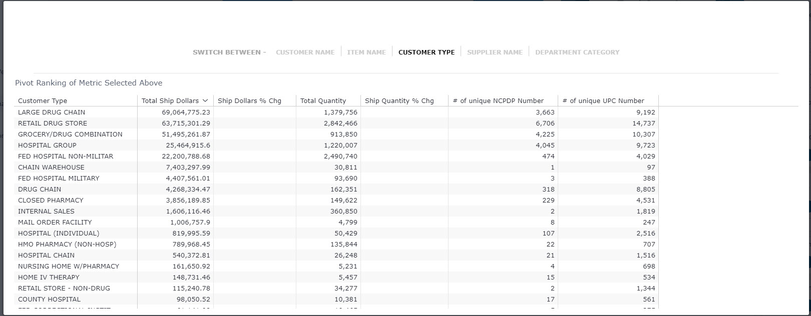
Table
The Table widget displays a broader view of your data, presenting raw and non-aggregated data in columns, with as many fields and metrics as needed.
Scatter Chart
Use the SCATTER chart to display the distribution and relationship of two variables. The circles on the chart represent the categories being compared (circle color), and the size or numeric data (indicated by the circle size).
Example: Compare revenue and units sold by gender.
Scatter Map
Use a scatter map to visualize geographical data as data points on a map. You can visualize up to two sets of numeric data using circle color and size to represent your data.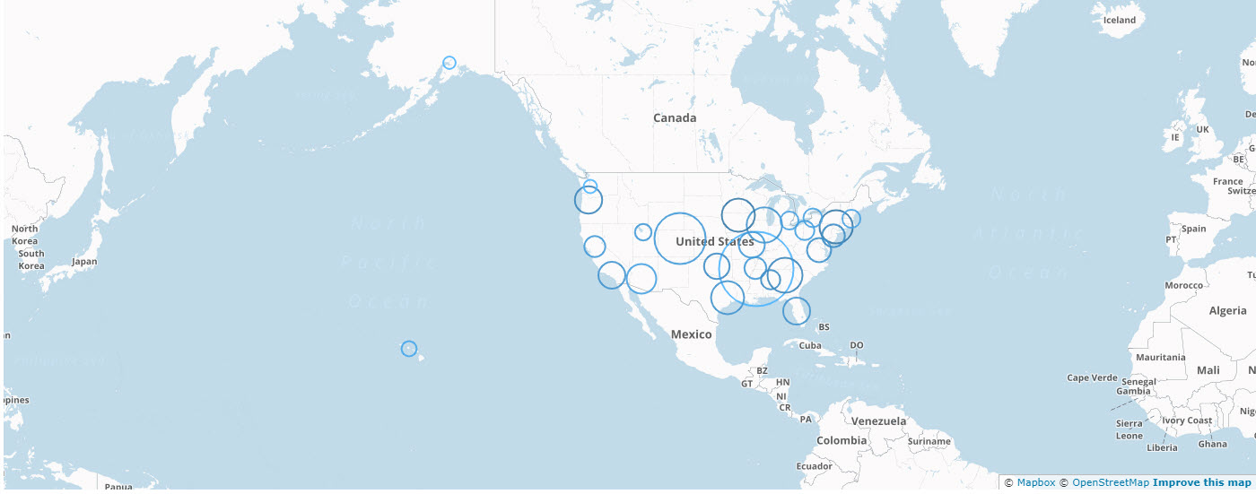
Area Map
Area Maps allow you to visualize geographical data as polygons on a map. You can use your data to affect the color of the areas.
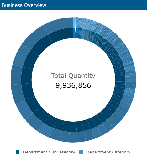
Sunburst Widget
The Sunburst widget is similar to a pie chart but is multi-dimensional. Whereas a pie chart combines one field and one numeric value, the Sunburst widget can display multiple rings, one for each field. Each ring in the Sunburst shows a breakdown of its parent ring slice.
Treemap
The Treemap is a multi-dimensional widget that displays hierarchical data in the form of nested rectangles. You can use this type of chart in different scenarios, for example, when you want to compare many categories and sub- categories.
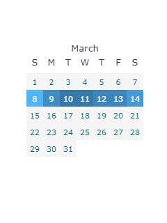
Calendar Heatmap
The Calendar Heatmap widget visualizes values over days in a calendar-like view, making it easy to identify daily patterns or anomalies.
You can choose to display the data in a number of ways including 1, 3, 6 or 12 months at a time. In addition, you can display a classic or week view.
Tabber
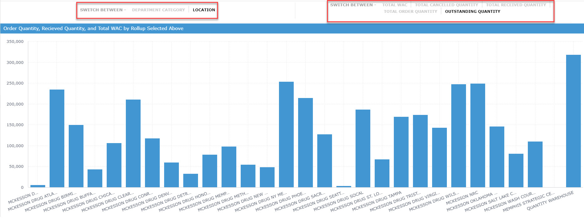
The Tabber widget is used to change the visualization from one measure to another. The bar chart below allows me to switch both my X and Y axes. I can switch my X axis by Category and Location. My Y axis can be filtered on many options, like Outstanding Quantity and Total Order Quantity.